Soar
Soar, a non-profit children and youth advocacy organization in King County, was seeking a new logo design as the result of a change in its mission which would be reflected in its new tagline, elevating community voice.
The design solution for the new logo features an icon containing two sound waves, representing community voice, radiating upwards and merging to form three figures which represent the children and youth that Soar works to serve. The chosen colors are meant to reflect the hues of a sunrise and communicate a feeling of warmth, positivity and aspiration.
The logotype, based on Avenir, was chosen for its geometric yet humanistic qualities and was modified to ensure that it would be harmonious with the icon. This was accomplished through adjustments to the font weight, terminal endings and counter spaces of the letterforms. For the tagline, Frutiger was chosen due to its friendly and approachable feel as well as for its clear readability.
In addition, the logotype and tagline were set in all lowercase letters to further give the appearance of approachability and to avoid the perception that the name is an acronym, as it was previously set in all uppercase letters.
As a result, the client was pleased with the new design and felt that the solution was appropriately suited to the organization and its mission.
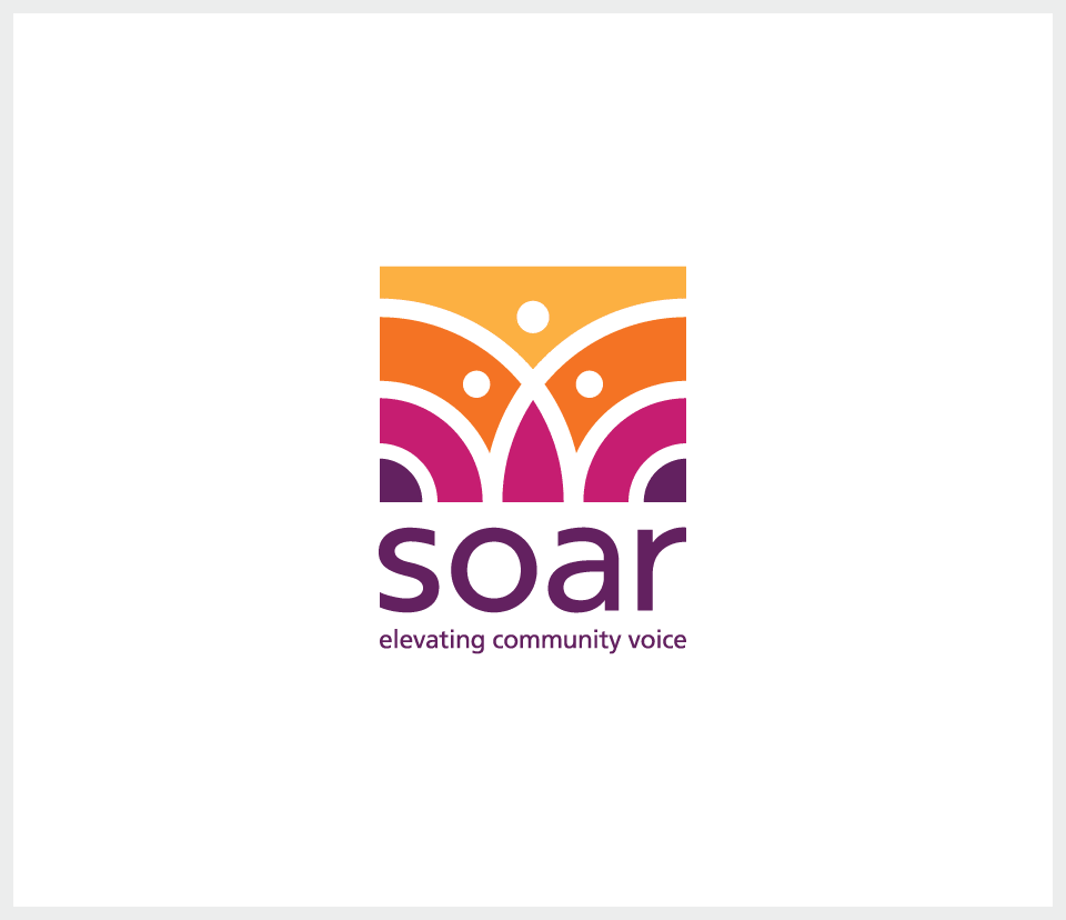
Primary version of the logo.
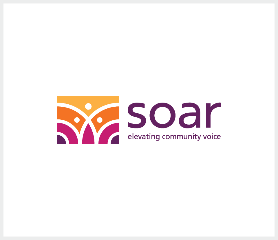
Secondary version of the logo in horizontal format.
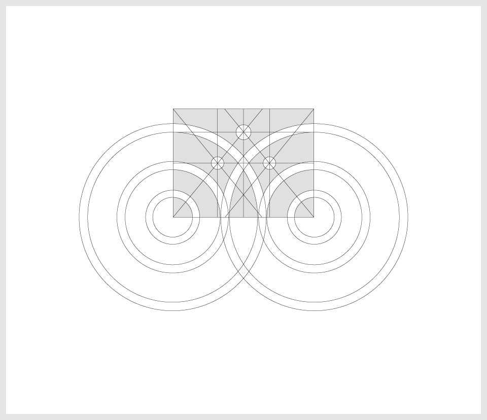
Construction of the icon.
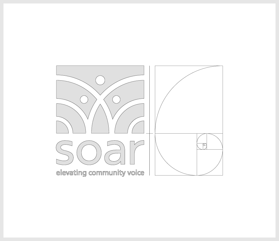
Proportions of the logo based on the golden ratio.
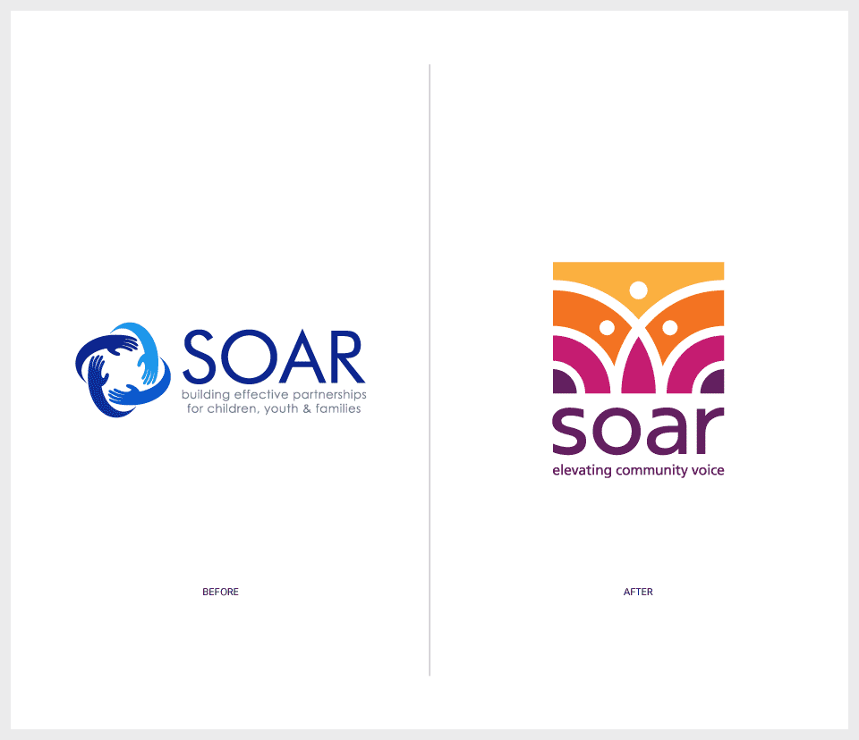
Comparison between the previous logo and the new logo.
Project Duties
Concept
Design